

👋 Hey, Sahil here - welcome to today’s edition of Venture Curator, where we break down how great startups grow, how top investors think, and what’s shaping the future of tech.
P.S. Get access to 100+ startup & VC resources, investor databases, fundraising templates, 150+ premium archive posts and exclusive startup research - all in one place.
FROM OUR PARTNER - FRAMER
Framer’s AI agents can now help build, edit, and manage your website

Framer is the AI website builder for teams that care about every detail. Agents work directly in the canvas, helping design pages, manage CMS content, write copy, add SEO, and audit sites.
Build faster: Create, refine, and publish production-ready pages in minutes.
Scale confidently: Manage content, localisation, and metadata across your site.
Stay in control: Review every change, collaborate in real time, and publish when ready.
Trusted by teams at Miro and Perplexity.
Partnership With Us
Get your product in front of an audience of 125,000+ - Our newsletter is read by thousands of tech professionals, founders, investors and managers worldwide. Get in touch today.
📜 DEEP DIVE
What does an AI startup landing page that converts look like?
Whether you’re putting up your first homepage or you’ve already rewritten yours three times, you’ve probably had the same thought: what are the AI startups that are actually growing doing on their websites that I’m not?
If you already have a site, you know how this goes. Each rewrite feels better, and nothing changes. Signups stay flat, demo requests come in at the same trickle, and eventually someone on the team says, “We should look at what Linear does” (the project management startup famous for its design), and the whole thing starts again. If you’re building from scratch, it’s the same problem from the other side: a blank page and a folder of screenshots from companies you admire.
Either way, you end up copying taste, not structure. Linear’s page works for Linear. What you actually need to know is what the pages of companies like yours, selling the way you sell, have in common. Nobody had written that down for AI startups, so I did.
In the last week of October, I went through the homepages of 34 funded AI companies, from early-stage startups to Harvey and Sierra, and logged what a visitor sees before they scroll: the headline, the sentence under it, the buttons, the proof sitting nearby, what’s next to the headline, and whether pricing is in the nav.
Then I sorted them by how each company sells, because that turned out to shape almost everything else on the page.
What came out isn’t a design opinion. It’s a count. And the patterns are clear enough that you can rebuild the top of your homepage, or write it for the first time, without guessing.
Here’s what we’re covering:
What do 34 funded AI startups actually put above the fold, counted?
Why does how you sell matter more than what you sell when it comes to the page?
What kind of headline do most of them use, and why is that the wrong one to copy?
What proof do they show, and what proof do they skip? (The answer surprised me.)
What sits next to the headline: screenshot, video, demo, or nothing?
The five patterns that repeat, and the five mistakes early-stage pages make
The full corpus: every headline, CTA and proof block, sorted by business model
The template: the block-by-block landing page structure, with the copy patterns to fill in
What 34 funded AI startups put above the fold
Let’s start with proof, because it’s where the biggest surprise was.
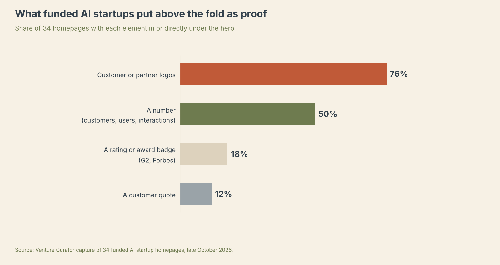
Three in four pages (76%) have customer or partner logos in or directly under the hero. Half have a number: “3,500+ legal organisations” (Harvey), “500,000 GTM teams” (Clay), “323M+ patient interactions” (Hippocratic AI), “3M+ developers” (Tavily). Fewer than one in five have a rating or award badge. And only 12% have a customer quote anywhere near the top.
That last number matters, because the customer quote is the first thing most founders add when they want “social proof.” The companies that have actually converted at scale don’t lead with quotes. They lead with logos and a count, and push quotes down the page where someone who’s already interested will read them.
Four pages have no proof at all above the fold: Lovable, Cursor, Gamma and Rox. Three of those are consumer-scale brands with tens of millions of users. If you aren’t one of them, you don’t get to skip this block.
How you sell decides what your page looks like
I expected pages to cluster by category: legal AI pages would look alike, voice AI pages would look alike. They don’t. They cluster by business model. Sort the 34 into three groups: companies that sell through a sales team, companies that sell with a credit card, and companies that sell to developers through an API, and the pages separate cleanly.
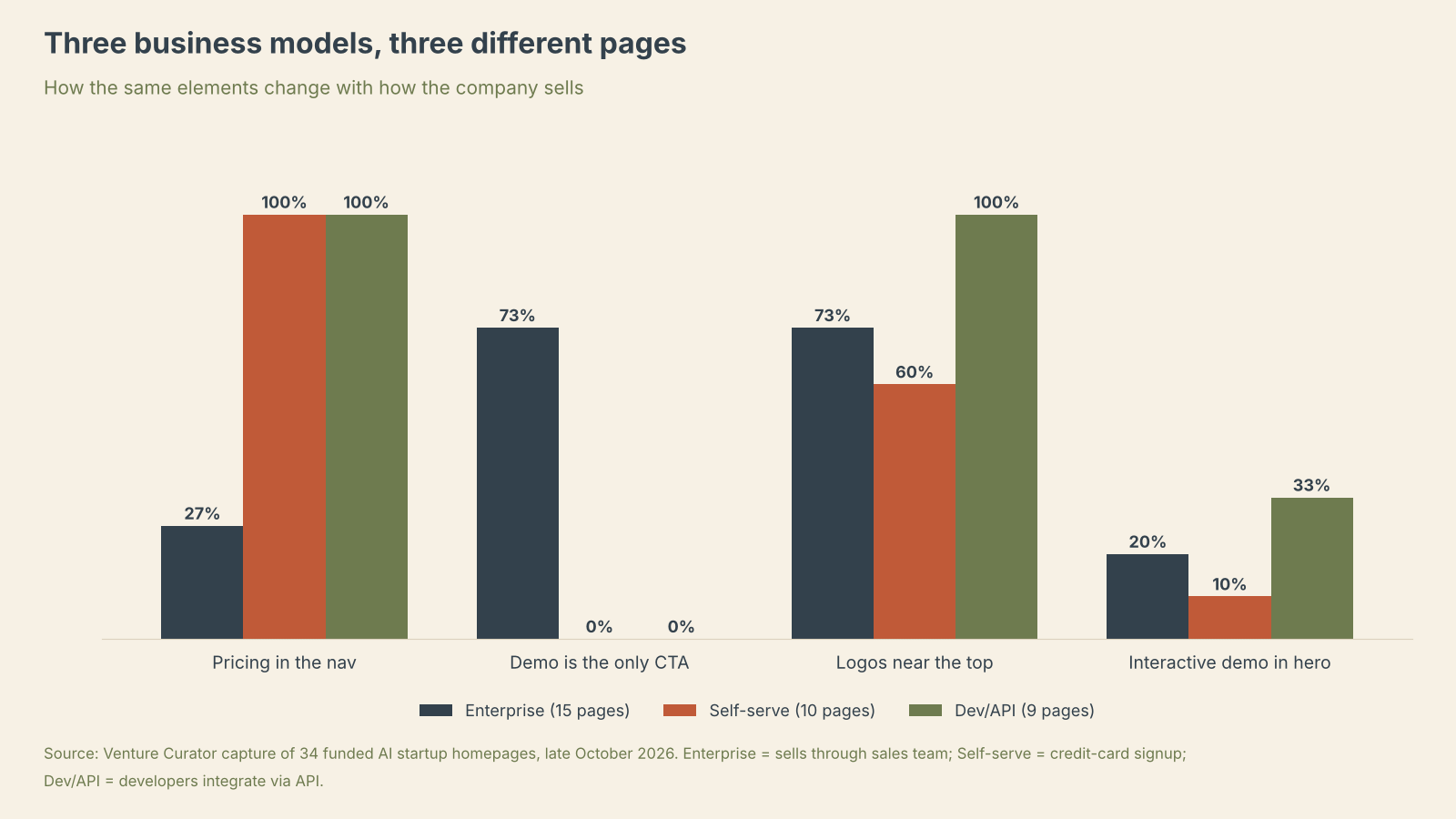
Pricing in the nav is the clearest split. Every one of the 10 self-serve pages and every one of the 9 developer pages has a Pricing link. Only 4 of the 15 enterprise pages do. Demo-only CTAs are the mirror image: 11 of 15 enterprise pages have “Book a demo” or “Request a demo” as the only way in, and zero self-serve or developer pages do. Every self-serve and developer page offers a free path, usually paired with a sales option.
Logos are nearly universal for developer products (9 of 9) and enterprise (11 of 15), and a bit less common for self-serve (6 of 10), where the brand itself often carries the page.
So before you touch a word of copy, decide which of the three you are. If you sell to a procurement team, your page is a demo page, and pricing in the nav will mostly generate tyre-kickers. If someone can sign up with a card, hiding pricing puts you at odds with every competitor in your motion.
Most headlines promise a feeling. That’s the wrong one to copy.
Here’s where it gets interesting, and where I think most early-stage founders go wrong.
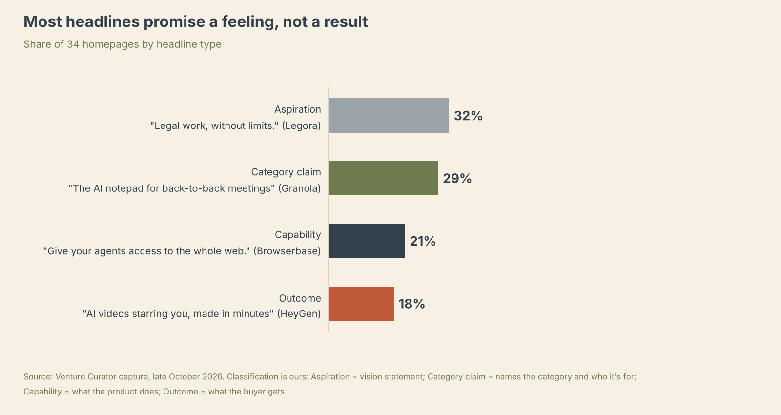
Aspiration headlines are the most common type, and the ones most founders copy. But look at who actually writes them, and you’ll see why they backfire for almost everyone else. Seven of the eleven come from the same kind of company, and that’s the whole problem.